Here is a quick critique of some of the organization schemes and navigation structures found on two websites — download PDF here.
Examining Information Architecture (two website reviews)
This is a brief assignment in which I was asked to identify information architecture elements of two websites (download PDF here):
Discussion: All sites need robust search
Websites with a lot of content and various types of content need a search system. In fact, I argue many content-heavy websites are sometimes better off with a more prominent search system than the navigation itself.
That may sound radical to some, but it’s quite necessary on many sites that have a continuous flow of content, such as a news website. Imagine a news website with a homepage that’s literally just a search bar — or even a store website, etc. There are benefits to browsing organized labels and navigation systems, but if you have an idea of what you are looking for, then you’ll be happier just to use a search system.
As for the perspective of designers, content producers and developers, if you know the majority of your site’s traffic is users who are entering the website from Google (or a social site such as Facebook) and those users are landing on a product page or specific article page, then why not treat your website as a mini search engine within the bigger search engine (Google) — ? New users aren’t likely to enter the site from the homepage anyway. If they do, they likely already have in mind what item they are looking for.
Sites with large databases of content — such as the Library of Congress — will always need their own search systems. Any type of library website will need such. Users on these websites are hunting for specific items of content which they know are buried among a vault of other types of content. It’s easier to search and not worry about browsing an endless amount of pages.
I have worked on large websites (websites with a lot of content) which have such terrible search systems that it’s actually easier to search for the website’s content on Google. I imagine this isn’t a unique situation, but it’s very depressing knowing your users are likely to bounce off your site to go back to Google for their content hunt, knowing you have the content they are looking for but you can’t offer them a better way to find it than Google can — you better hope you know your SEO.
Mini search engines
I believe sites with good search systems will be able to retain more users and create a better experience overall. As stated, we’re building mini search engines within the bigger one. We’re helping people filter through content.
Take a look at the Library of Congress:
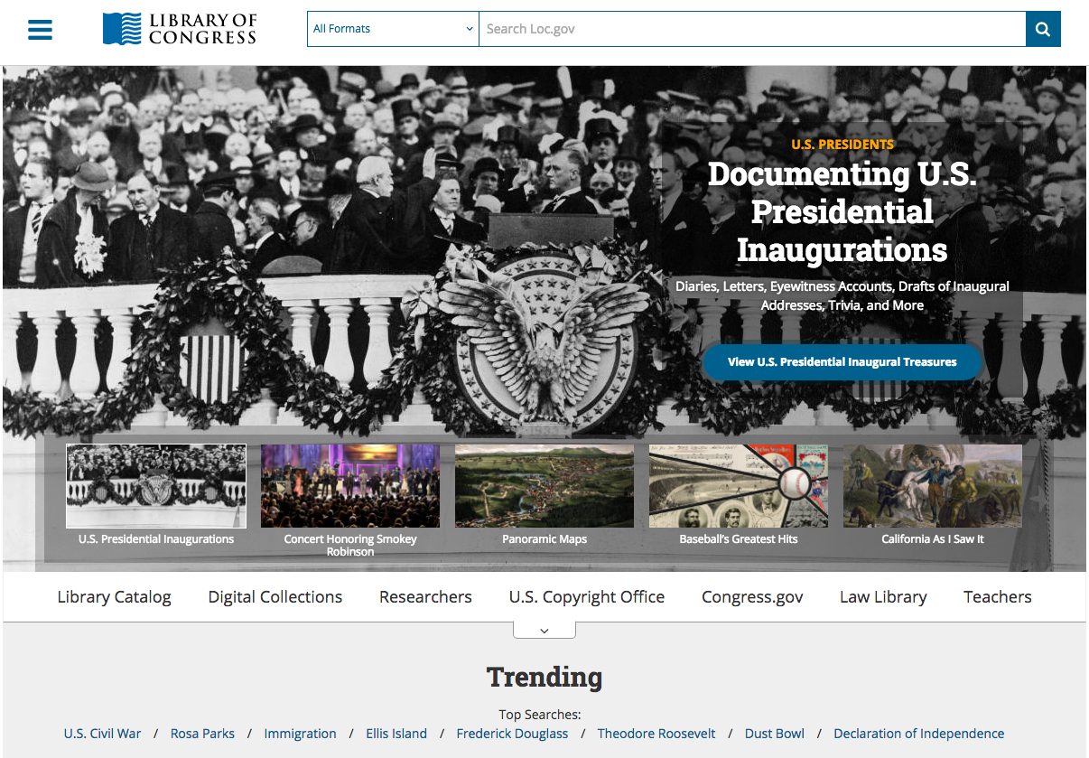
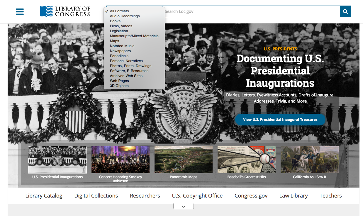
I’ve used this website a lot for old file photos and such. But I have never once started my search for something on this at another place other than that search bar at the top. The Library of Congress has offered a way to refine searches, too, before the user even executes the search — take a look at the dropdown:
I believe more websites should be putting a bigger emphasis on search systems, especially when it’s obvious users will be overwhelmed by browsing.
Labeling: Redundancy can be very helpful to the user
Moosejaw is one of my favorite clothing stores, and it’s not even because I love all of their clothes so much — I don’t.
I admire the company’s overall marketing and customer service approach. Perhaps more importantly, I like their digital platforms. Moosejaw is known for its online catalog and store.
Here’s a screenshot of the Moosejaw.com desktop homepage:
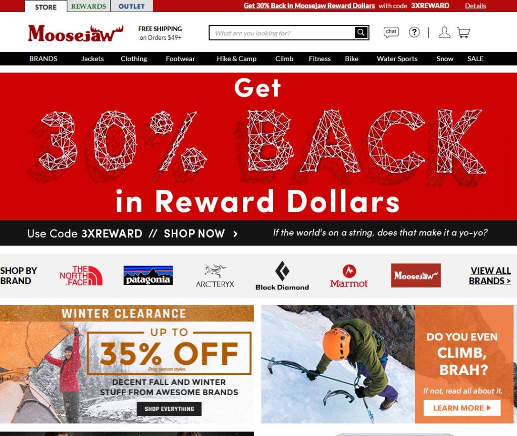
Moosejaw has the main navigation labeled by a mix of activity and product types and a special link for “BRANDS,” which leads the user to believe this will allow them to view the clothes or other items by brand. One label that is confusing to me is “clothing,” because that seems quite redundant. Moosejaw sells much more than clothing, but when you see the word “clothing” next to “jackets,” you might be a little confused. Is there a better label for this?
Of course, I will assume Moosejaw has a team of UX designers and information architects researching what customers are looking for on the site and they have adjusted the main navigation to reflect such — hehe. This one “clothing” label may seem like a very minor thing, but it definitely threw me a bit when I first came to the site after being away for some time. When I read “jackets” and then “clothing,” I wondered why jackets wasn’t under “clothing.” It doesn’t make hierarchical sense to me, and I wonder if other users are little confused by this, too.
Upon further review, however, “jackets” can be found under the “clothing” label. So all is good. Someone decided “jackets” was important enough to have its own label in the main nav, but they decided to keep it in a hierarchical position under “clothing.” I wonder why. The obvious answer is that jackets is the most popular article of clothing the site sells, but I am only assuming. Maybe Moosejaw is trying to sell a huge inventory of jackets and they don’t care about the user tendencies at all — probably not the case.
That’s just one example of the redundancy on the website. If you hover over “Hike & Camp,” as another example, you’ll see there is another section just for hiking and camping clothing. The user probably doesn’t know this if he or she is coming to the site for the first time. Moosejaw has decided to label its site sections by the type of activity — minus “jackets,” “clothing”, and “footwear” — but understands not all users will approach the site in this way. So it offers a lot of redundancy in the navigation labels.
Overall, I believe this is good labeling, except for a couple areas of confusion that I pointed out. Customers (users) are looking for specific products based on specific activities, but some are just looking for clothing (or more specifically, jackets and footwear). Moosejaw has to balance this on the site, and I think the site architects are doing a decent job of this by offering multiple ways of accessing the same content.
One more example scenario which uncovered a slight labeling issue:
Let’s say I am coming to Moosejaw.com looking for climbing clothes. This can be found under the “clothing” label and under the “climbing” label. However, it’s labeled “climbing apparel” under the “climbing” label, not “climbing clothing.” That’s a bit inconsistent with the way the rest of the “clothing” categories are labeled in the navigation — they are labeled with the word “clothing.” I honestly missed “climbing apparel” under the “climbing” tab because I was looking for the word “clothing.” That’s a problem. Whether it’s a major or minor problem is up for debate — I am just one man. However, I believe these small issues in labeling can turn into big ones and it all comes back to one crucial point to remember in labeling: consistency.
Another example
I have been working on my own “redundancy” endeavors over on ClickOnDetroit.com, where the top level navigation can be a nightmare because it has to cater to a TV and online audience — that’s a work in progress. Without cluttering the navigation, redundant labels have increased the site content’s findability overall. I have had to focus on “bottom-up” content — article pages — and where users can go from each piece of content to another. They will enter the site at an article page, and it is our job as content producers to direct them to more content which will interest them, or at least the content he or she needs.
Here’s one example — http://www.clickondetroit.com/automotive/president-trump-to-meet-with-heads-of-detroit-big-3-automakers — notice on that page there is a “Related” subhead in the article body followed by bullet-pointed headline URLs. Inserting related content is key on these types of news websites to increase findability, and we can measure the “recirculation,” or how many users go from one piece of content to another.
The point is it all comes back to labeling content correctly and consistently. These “related” articles are available on other parts of the site, but putting them in front of users’ eyes is a better experience overall. And users should be trained to expect this. We must offer consistency to the user so he or she knows what to expect and where to expect it.
Discussion: Information Architecture happens, no matter who does it
I find myself getting lost in sites with confusing navigation structures and poorly organized content. I define confusing as any time I have to look twice for the main navigation or when pages within the site have extremely differing structures and layout from the home page for no apparent reason. As for the content: Anything I may come to a site looking for should be logically categorized and organized.
Content overload
This is a common case on sites with a vast range and amount of content. News media websites can fall victim to this type of disorganization. It is usually obvious when a site is experiencing “content overload.”
Symptoms include:
- Content has started to bleed into a disorganized mess of horribly labeled links
- Content is unsearchable because it is poorly labeled and/or categorized
- Navigation menus change depending on what page a user is viewing
Fixing these common issues can include the following steps:
- Create a content inventory
- Audit the content inventory
- Diagnose category issues as part of the content audit, then fix the issues
- Diagnose navigation issues and fix
Diagnosing these issues will require some user research and possibly usability testing. A lot of issues usually are apparent in site analytics reports. User behavior can be tracked by studying metrics including sessions, time on page and even bounce rate.
I have conducted many site content audits which can really lift a heavy load off of such an endeavor. In my experience, usability issues can be uncovered just by taking a deeper, closer look at how the site content is categorized and where it lives on the site. A lot of it gets the axe, too, once it is dug up and analyzed. And that’s always fun, like cleaning out a messy garage or attic.
Content producers can be responsible for a lot of the information architecture on a site, whether he or she is aware of it or not. Being aware of it is usually the first step in the right direction.
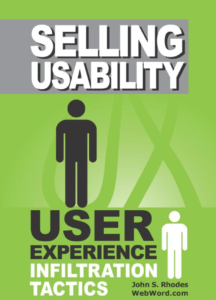
Book Review: ‘Selling Usability: User Experience Infiltration Tactics’ by John S. Rhodes
 The phrase “user experience infiltration tactics” was enough to get me interested.
John S. Rhodes offers his advice, based on his professional experiences, about spreading the knowledge and influence of usability practices within an organization. Rhodes’ major assumption is that his reader is a usability and UX proponent who wants to “infiltrate” his or her own company with these practices. So, if that’s you: Read this book.
“Selling Usability” can be a scary term for those of us who understand it’s strengths. We are likely working within organizations who do not put the user (customer) first. Rhodes warns it’s not something to broadcast and scream about to colleagues who don’t want to hear it. It’s better to spread your knowledge slowly, methodically, and remain open as a beacon of usability and UX resources in your organization. Control the story, Rhodes writes, and be prepared when the opportunity reveals itself for you to flex your usability and UX muscles.
And never forget:
“The ideas you have about UX don’t mean much if you cannot translate them into something tangible for stakeholders and end customers … the trick is to become the intelligent link between the creative forces in the organization and the sales and marketing folks.” — (Rhodes, p. 99)
That was pulled from the summary of Chapter 17 — “Artful Intelligence: Mesign, Mevelopment, and Darketing.” It represents a recurring theme for Rhodes: Have enough empathy to recognize the needs of people (users) who only think about themselves and always inject UX to help them.
Infiltrate, infiltrate, infiltrate.
Available through Amazon: Selling Usability: User Experience Infiltration Tactics
Analyzing the results of eye tacking
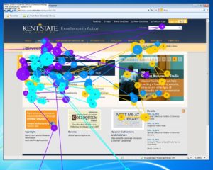
This past week I put together a report about an eye tracking study for Kent State University’s library website.
The task was: Ask the library to order your favorite book.
This proved to be a huge difficulty for the five participants. They had no idea where to start, what to do, and how to do it. Most of them (4 out of 5) just gave up and said they would rather just call the library.
What’s most interesting, perhaps, is that none of the participants ever thought of using the library website for such a task before participating in this study. It had never crossed their minds. That made this task so much more difficult for them.
To improve this study, we would want to give the participants a task which they would have considered, or even completed, before.
Here is my full report:
Benefits of eye tracking usability studies
“The Ketchup Bottle Problem”
In their “How to Conduct Eye Tracking Studies” report, usability experts Kara Pernice and Jakob Nielsen suggest such studies can help reveal:
… the time a person spends on a page, the action he takes there, what he reads aloud, what he hovers the mouse
over, whether he smiles or grimaces, and what he comments on.”
Pernice and Nielsen spend the rest of that report describing how to best conduct such studies, as the title would suggest, and they do so thoroughly starting with participant recruitment.
That may be all one needs to know before starting his or her own eye tracking study — they gave you the reasons to do it and explained how to get it done. However, questions remain including how they’re so sure there is anything to measure in the first place. I found their answer to this question in Chapter 1 of Pernice and Nielsen’s “Eyetracking Web Usability” book. They call it the “mind-eye hypothesis” and describe it as follows:
Knowing where people look would be worthless if it didn’t tell us something about their behavior. Fortunately, it does, thanks to the mind–eye hypothesis, which holds that what people are looking at and what they are thinking about tends to be the same.
If taken to the extreme, the mind–eye hypothesis may seem ludicrous. Looking at and thinking about are certainly not always intertwined. You can think about pink elephants without looking at one. And your thoughts may be on freshly deep-fried donuts while you’re sitting in your car when the stoplight changes. You may not be paying attention to whatever happens to be within your foveal vision, such as the light turning green, until a honk from the car behind you wakes you from your donut dream.
According to the mind–eye hypothesis, people are usually thinking about what they are looking at. They do not always totally understand or engage with it, but if they are looking, they are usually paying attention, especially when concentrating on a particular task.
This makes sense in the world of websites and any digital interface. If an item on a page is clearly visible to a user, and the user is obviously looking right at it, then what could explain why the user does not find it and interact with the item? Where is the user looking? Why? If we can follow this user’s eyes, then we may start to understand how to answer these questions and ultimately how to optimize the website to better serve that item to the user.
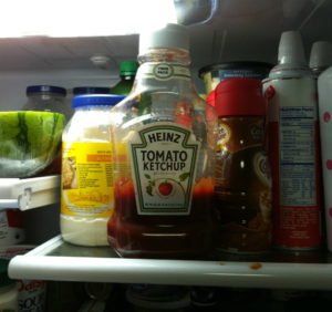
As an everyday example — not a digital life example — of this “dilemma,” if you will, Nicholas Gould and Jesse Zolna shared the “Ketchup Bottle Problem” in their article titled “Eye Tracking and Web Usability: A Good Fit?“:
… consider a person staring into an open refrigerator searching for the ketchup. They may be staring directly at the bottle yet, for a variety of potential reasons, might not be paying sufficient attention to it to realize that it’s there at all. Eye tracking would tell us that this person “saw” the ketchup even though they might personally report that no ketchup was present. The risk of this scenario is that eye tracking could erroneously conclude that the user was “successful” in their task of finding the ketchup when they clearly were not.
However, when combined with other data points, this apparent risk can be converted into an opportunity to derive a potentially important observation. Specifically: does the user fixate on the ketchup but not take it out of the refrigerator, or self-report that they didn’t see it? This would indicate that, in fact, they did not “see” the bottle despite its prominent location. This, in turn, would suggest that researchers need to ask what other factors could be at play that prevent the bottle from attracting attention or comprehension (e.g., the bottle is opaque, uses an unfamiliar label design, etc.).
The benefits of eye tracking are clear — you will be able to measure:
- Time on page
- User behavior on page
- User’s vocal behavior during a task
- Where the mouse is placed
- User’s facial expressions
And there’s even more to this, according to Pernice and Nielsen (from Chapter 1 of “Eyetracking Web Usability”:
Eyetrackers as Input Devices
Finally, eyetrackers can go beyond testing to become part of the user interface itself. If the computer knows where the user is looking, the software can adjust the display to present more information about the things the user cares about most. As a simple example, if a user was staring intently at a thumbnail photo on an e-commerce site, the site could automatically display a bigger version of the photo instead of waiting for the user to click a zoom button.
Yes, that means computers can get smarter by tracking a user’s eyes. Very exciting, indeed.
Of course, there are drawbacks and roadblocks to all of this, primarily the cost of conducting such tests. The tools of the eye tracking trade do not come cheaply, relatively speaking, nor are such tools readily available to the average usability and UX teams. But that is an ongoing debate.
The bottom line is: If the data is steady, reliable and clear, then the test is worth it. I believe it is important to place an emphasis on making eye tracking technology more affordable and available to usability practitioners. The benefits are apparent.
Mobile Device Usability Test Setup
Over these past few weeks I have undertaken the task of putting together the plan for a mobile device usability testing setup. There are a lot of little details — from hardware to software — to pay attention to. You can view my full proposal here or below.
The main issues I had was how to set up the testing room’s hardware without getting too carried away. A setup like this needs to be effective without being too costly. I decided to keep it as simple as possible — connecting two cameras to a computer which will be recording feeds and sharing its screen. The observers will be watching from another room.
Mobile usability testing should be done remotely, even when the test is being conducted at a usability lab. The lab gives us a bit more security with the feeds and access to the participants one-on-one while maintaining a natural environment (see the report).
With this setup, testers will be able to interview this participants, too, and have them fill out a questionnaire at the lab.
Usability Testing: Yes to gesture tests!
It’s absolutely necessary for usability studies to include steps for testing gestures, specifically on user interfaces which will be used on more than one device.
A gesture test could be included as its own separate study within the overall usability testing study of the interface. There could be specific gestures to be tested, which means the usability professionals need to know before testing which gestures they are testing — much like we saw the list of gestures for a smartphone map interface in this week’s module.
Or, the gestures could remain completely unknown. Usability testers could ask participants to perform a task without telling them any gestures to use. The expectation would be that the participants will use a gesture they are comfortable with, and see if it’s received appropriately by the interface.
Dan Saffer talked about this a bit in his “Designing Interactive Gestures” presentation. He said his team which developed a gesture-based, motion sensor TV interface went into their study with gestures already planned for each task, only to be completely denied by the participants who hated the gestures. Saffer warns not to do this, probably because it was a waste of time for his team of testers.
Results of such tests should be described in terms of:
- successful task completion vs. unsuccessful task completion
- user satisfaction (is the gesture natural? does it fit the task?)
- whether a gesture fits the user’s environment (is this something someone would feel comfortable doing in a public place? etc.)
- how universal a gesture is (will this work in every culture?)
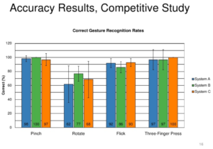
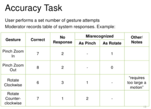
Kevin Arthur’s presentation on “Evaluating Touch Gesture Usability” includes a few ways to display such results. He also shows some examples of competitive study results. Check that out for more on results. The image above shows one of his graphs for displaying the results of gestures on three different systems.
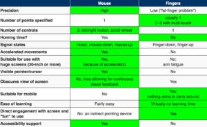
Meanwhile, back to the overall need for gesture testing: In his article titled “Mouse vs. Fingers as Input Device,” renowned usability professional Jakob Nielsen writes:
“The fact that the mouse and touch input have so different strengths is one of the main reasons to design different user interfaces for desktop websites and for mobile sites. (And also for desktop applications vs. mobile apps.)”
I believe this statement from Nielsen sums up the need for gesture usability testing. When you’re designing something for such different input devices such as the mouse and finger, it’s very important to test what gestures a human will want to/be able to use with each device in a given environment. As Saffer pointed out in his motion sensor TV test, the participants in such tests have the power to make the test organizers feel really embarrassed about their hypothesis.
From Nielsen’s article: