Moosejaw is one of my favorite clothing stores, and it’s not even because I love all of their clothes so much — I don’t.
I admire the company’s overall marketing and customer service approach. Perhaps more importantly, I like their digital platforms. Moosejaw is known for its online catalog and store.
Here’s a screenshot of the Moosejaw.com desktop homepage:
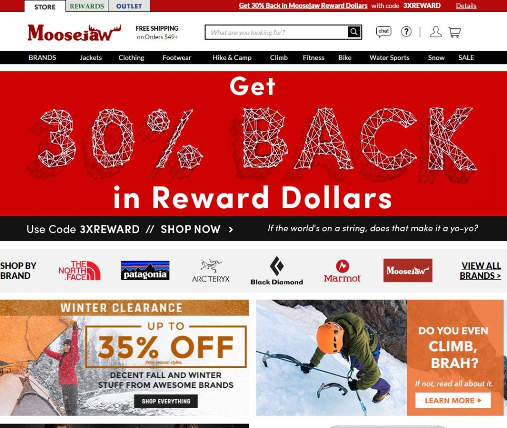
Moosejaw has the main navigation labeled by a mix of activity and product types and a special link for “BRANDS,” which leads the user to believe this will allow them to view the clothes or other items by brand. One label that is confusing to me is “clothing,” because that seems quite redundant. Moosejaw sells much more than clothing, but when you see the word “clothing” next to “jackets,” you might be a little confused. Is there a better label for this?
Of course, I will assume Moosejaw has a team of UX designers and information architects researching what customers are looking for on the site and they have adjusted the main navigation to reflect such — hehe. This one “clothing” label may seem like a very minor thing, but it definitely threw me a bit when I first came to the site after being away for some time. When I read “jackets” and then “clothing,” I wondered why jackets wasn’t under “clothing.” It doesn’t make hierarchical sense to me, and I wonder if other users are little confused by this, too.
Upon further review, however, “jackets” can be found under the “clothing” label. So all is good. Someone decided “jackets” was important enough to have its own label in the main nav, but they decided to keep it in a hierarchical position under “clothing.” I wonder why. The obvious answer is that jackets is the most popular article of clothing the site sells, but I am only assuming. Maybe Moosejaw is trying to sell a huge inventory of jackets and they don’t care about the user tendencies at all — probably not the case.
That’s just one example of the redundancy on the website. If you hover over “Hike & Camp,” as another example, you’ll see there is another section just for hiking and camping clothing. The user probably doesn’t know this if he or she is coming to the site for the first time. Moosejaw has decided to label its site sections by the type of activity — minus “jackets,” “clothing”, and “footwear” — but understands not all users will approach the site in this way. So it offers a lot of redundancy in the navigation labels.
Overall, I believe this is good labeling, except for a couple areas of confusion that I pointed out. Customers (users) are looking for specific products based on specific activities, but some are just looking for clothing (or more specifically, jackets and footwear). Moosejaw has to balance this on the site, and I think the site architects are doing a decent job of this by offering multiple ways of accessing the same content.
One more example scenario which uncovered a slight labeling issue:
Let’s say I am coming to Moosejaw.com looking for climbing clothes. This can be found under the “clothing” label and under the “climbing” label. However, it’s labeled “climbing apparel” under the “climbing” label, not “climbing clothing.” That’s a bit inconsistent with the way the rest of the “clothing” categories are labeled in the navigation — they are labeled with the word “clothing.” I honestly missed “climbing apparel” under the “climbing” tab because I was looking for the word “clothing.” That’s a problem. Whether it’s a major or minor problem is up for debate — I am just one man. However, I believe these small issues in labeling can turn into big ones and it all comes back to one crucial point to remember in labeling: consistency.
Another example
I have been working on my own “redundancy” endeavors over on ClickOnDetroit.com, where the top level navigation can be a nightmare because it has to cater to a TV and online audience — that’s a work in progress. Without cluttering the navigation, redundant labels have increased the site content’s findability overall. I have had to focus on “bottom-up” content — article pages — and where users can go from each piece of content to another. They will enter the site at an article page, and it is our job as content producers to direct them to more content which will interest them, or at least the content he or she needs.
Here’s one example — http://www.clickondetroit.com/automotive/president-trump-to-meet-with-heads-of-detroit-big-3-automakers — notice on that page there is a “Related” subhead in the article body followed by bullet-pointed headline URLs. Inserting related content is key on these types of news websites to increase findability, and we can measure the “recirculation,” or how many users go from one piece of content to another.
The point is it all comes back to labeling content correctly and consistently. These “related” articles are available on other parts of the site, but putting them in front of users’ eyes is a better experience overall. And users should be trained to expect this. We must offer consistency to the user so he or she knows what to expect and where to expect it.
Leave a Reply