Content ROT — my experience

by

I recently contributed my thoughts and experiences with “content ROT.”

“ROT” stands for “redundant,” outdated (or obsolete) and “trivial” content on a website, or any digital platform.

Here’s what I presented to graduate students in a content strategy class:

Content ROT — what it is

From my understanding and experience, “content ROT” refers to the current “bad” state of content on a website, or any digital platform.

As our readings indicate this week “ROT” literally stands for “redundant,” “outdated” (or obsolete) and “trivial.” This type of content represents the plight of a website content manager, and I am speaking from experience when I write that. It is a full-time job to make sure your content is not redundant, outdated and trivial. The consequences of failing to ensure your content is not “rotting” are severe.

Redundant content

For instance, redundant content can confuse users, get you penalized by search engines and just plain make your life miserable on the back end with unorganized garbage. Often, what I’ve found is steps need to be taken each day to avoid and/or fix this type of redundant content. If you’re working for an organization which pumps out a large amount of daily content, going back and updating and/removing redundant content is just part of the daily process.

Outdated content

Updating and/or removing outdated content is also part of this process. Sometimes a CMS will have a “schedule to expire” or “schedule to unpublish” feature which can help a content manager immensely. If you know when a piece of content will be out of date when you publish, then there is no excuse not to set an expiration date for it. Now, knowing when content is out of date is not always the case. Identifying out-of-date content can be a struggle. Skilled content managers will have a strong grasp of how his or her CMS metadata and category fields work and how to make this work for them. That means when someone comes to you and says, “Hey, all of this XYZ type of content is outdated or obsolete, fix it,” you know exactly where to find it and how to do that. Plus, you should know what to either “replace” this content with or where to send users instead. Tracking down and redirecting URLs can be made easier with a strong grasp of how to use the CMS.

I have worked on several different daily weather forecast sites which can be quite the 24/7 challenge. As stated, setting expiration dates and such is a must-do just to ensure users are not confused and mislead. Moreover, content like this (weather content) needs to be gone and replaced by updated content in order for your content to have any life in search engines or social. But, as stated, all URLs need to be redirected back to updated content. This can be daunting, which is why it is so important to understand the life cycle of content before it is published.

Trivial content

“Trivial” content is usually content which is demanded or even created by someone who literally wants to ruin your life haha. But seriously, in any organization there is always going to be a certain amount of useless content which achieves nothing for the company’s overall strategy, brand and bottom line. Sometimes I like to refer to this type of content as “selfish” content. Someone, even one person, felt it was important … but, it’s not. This content needs to be fought back and/or removed from the playing field. That’s easier said than done. The best thing to do is make sure you know about all of it, where it lives within the site.

As Chapter 3 in “Content Strategy at Work” mentions, a content ROT analysis is just the beginning. You may be able to trim the fat with such an analysis, but you really won’t be able to learn much about the value of your non-redundant and up-to-date content. All you know is it’s the best you have to offer. I have worked on websites where there has been a ton of content — maybe 50 percent — that just needs to go. But cutting that content out might not do you any favors in SEO and analytics if it’s all you have to offer. There’s a bigger issue at play here: you have bad content. Again, a ROT analysis is just the beginning.
A reminder: What your stakeholders want vs. what your users want

by

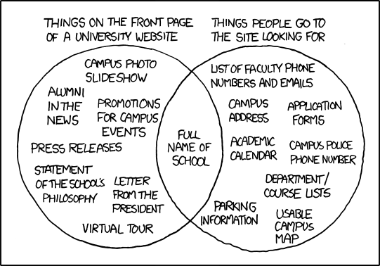
I recently was reminded of one of my favorite diagrams which depicts how content strategy is often ignored.

It’s this simple:

diagram-website-content-needs-vs-real
Credit: xkcd.com

Right?! Doesn’t every website you’ve ever visited have this problem? Just swap out “university website” with “news website” or “health insurance” website … or anything else. I particularly love the “full name of school” part. At least there’s that.

Buried content

This is the consequence of not conducting user research and of not understanding your content and where it lives within the hierarchy of the site. A simple study of at least three target users would reveal this “buried content” problem.

For anyone who has ever examined the behaviors of concurrent visitors to a website, this issue would become blatantly obvious if you’re watching how visitors are getting to your content. Users may be entering your site from a social media site or even from search (kudos to you if they are!) but what about the ones on your homepage? Why aren’t they finding this content? Are you burying the items of content your users actually want and instead flooding your homepage with, well, what they don’t want?

What stakeholders want vs. what users want

The problem often times is stakeholders will want to have certain items of content be prominent on a homepage. There are several reasons for this, not the least of which are sponsored content items, content which is pushing a specific campaign, and branding.

As designers and content strategies, we have to meet those demands. These are the people who are paying us, after all. However, somehow we have to find a way to compromise and get this space shared with the content are users want. Showing stakeholders the numbers (metrics on user behavior) can help solve some of this contradiction. But we need to put the work into gathering these metrics.

That’s our job — pleasing our stakeholders and our users. There is no one or the other.

Knowing our users and their behavior is the first step.

One simple task

  • Identify the most sought-after piece of content on your website. Do this either by going back through your analytics or examining your concurrent visitors. Examining your concurrent visitors may be a better idea since the most sought-after content on your website might change depending on the day, month, year. Who knows. I am hoping you do.
  • Next, you’ll want to recruit at least three target users who, preferably, have never visited your website before. They are people who would seek use for this content item.
  • Give them a simple scenario and task, such as: You want to ___, so you go to ___.com for (the content).
  • Observe them. I suggest recording the screen. This can be done remotely, of course.

This simple little task will reveal so much. It will reveal whether this content is findable from your homepage and whether it’s actually helping your users successfully complete the task, which is another issue in itself. But for now, you want to know about the former.

The Great ClickOnDetroit Content Audit of 2017

by

Before I can begin “The Great ClickOnDetroit Navigation Redesign of 2017,” I must first complete “The Great ClickOnDetroit Content Audit of 2017.”

This begins with none other than spreadsheets and sitemaps. As an information architect, this excites me in the nerdiest way possible.

Here’s the plan: 

  • Collect all pages (static, not article pages) and record the URLs, page names, page titles with specific notes about the content on each page into a giant spreadsheet, with the hierarchy of pages made clear.
  • Create a sitemap (blueprint) of the pages which is married with the current global main navigation. I am using a site mapping tool called Slickplan for this.

Then what?

Once I have my static content pages and their location within the site hierarchy all laid out in front me (I can’t wait, seriously) … then it’s time to audit. That means trimming the fat. I have the advantage of already knowing what my stakeholders (which includes me) want to keep want to say bye-bye to.

This is the first step. It’s laying the groundwork for the navigation redesign. The spreadsheet and sitemap will be extremely useful moving forward.

Here’s a quick look (view full page here) at my sitemap being built in Slickplan (work in progress):

Visualizing content strategy within UX design

by

Here is one interpretation of content strategy within the bigger picture of UX design.

Content strategy covers areas of UX design including the collection of content, writing, editing, producing, managing, governance, style guide production and collaboration with everyone within an organization who has ownership or expertise in a content area.

Collaboration with content owners might be the most important, and most challenging, facet of content strategy. I know this firsthand after years of working as a digital editor in a newsroom. Nothing brings out stronger opinions than content, no matter what kind of content it is. It can be a delicate and dangerous seven-letter word. A content strategist must understand this to survive.

Content strategy is a piece of the UX design puzzle. Without it, a UX design project or initiative will fail. And that means an organization relying on a UX design team will ultimately fail.

You may download a PDF of this file here.
visualizing-content-strategy-within-ux-design

Content strategy: Delivering structure to ambiguous things

by

I was recently asked during an interview for a UX job if I thought of myself as a person who likes structure or ambiguity more.

This struck me as odd. Not because it was a bad question. It was an excellent question. But I fumbled the answer. Maybe that was the point, yet it bothers me I could not offer a better answer. I said I like structure, but I deal with ambiguity on a daily basis. I need to work with both to survive.

That’s because in the content world, I thrive off of both structure and ambiguity. I make my living by delivering structure to ambiguous things — that’s content, in a nutshell. A colleague of mine gets the credit for making this clear to me: “we deliver structure to ambiguos things,” he repeats when it’s evident I am struggling with a pile of unstructured content. As editors and writers, our entire lives revolve around gathering pieces of information and turning them into something that makes sense as a whole.

That’s where creativity plays such an important role in content production. Every piece of content, whether it be data, a photo, a video, a quote, a fact, one word, etc., is part of a larger story which we need to put together for audiences. There is always a message to be delivered and the message may not be clear at first. But when structure is offered to a story and it is married with the appropriate design, great things can be accomplished.

This is what’s at the center of good content strategy. While we must deal with ambiguity as strategists and designers, we cannot fail the users by delivering ambiguity to them. The deliverable must take ambiguity and add structure to it so that it delivers a message, a story.

Combining content strategy and UX design

by

As someone who has worked in content production and management, I can tell you it can feel like the backbone of everything, that everything lives and dies with your content production, the quality of the content, and how well you govern and manage it all. Maybe that feels like a bias statement to you, especially if you believe design trumps all. But I can tell you I have seen terrible product (website) designs succeed because high quality content carries it. And I know Bill Gates in 1996 would agree with me. Of course, a lot has changed in 20 years. Still, content is king when it comes to digital publishing.

In terms of UX design, where the focus is on serving the user with his or her needs, content is still king. However, content needs to be married to the design process. I do not believe it can be an afterthought. UX designers (UX design teams) need to have a strong understanding of the product’s (website’s) content because often it is the meat of the site. Content may not be the process and goal of a task-based website, but it helps users understand the process and directs them to the right points. Content often is the doorway into a website, too. It’s how you “get found.” It’s the first impression. It’s the brand.

Sometimes content is the product itself (such as a news website or blog). But more than ever these days, content is meant to deliver a message on behalf of someone else or a company. A UX designer (UX design team) needs to be immersed in this content, whatever it may be. The team needs to know everything about it — how it’s created, where its found, how its collected, how it is being managed and governed, how compatible it is with each platform on which it will be made available. Understanding content is understanding people. So it takes empathy and it takes research to truly understand the message one is working to deliver. That’s content, and that’s UX design.

Understanding the scope of content strategy will make all of us better UX designers, and better people in general. A lot of big companies understand this and place a large emphasis on not only the content they serve to their customers but also the in-house content which is given to employees. I believe this is what a lot of UX designers will be running into more often. It’s our job to understand people, their content and how to relay the message, then tie it all together with a strong design.

Redesigning a community library website

by

Have you ever tried to use your local community library website?

What did you visit the site for? What did you find when you got there? Was it anything useful?

Research revealed it likely wasn’t a pleasant experience, and you probably picked up the phone and called the librarian for help finding the information you needed.

It doesn’t have to be this way. The Upper Sandusky Community Library is an example of a municipal library website which was failing its stakeholders and patrons. The following report details research that was conducted and how it impacted the redesign. Download the report here.

Award-winning news page design — Tragedy on the Trail

by

The Michigan Association of Broadcasters recently awarded me and my colleague a “best in category” award for new media.

Tragedy on the Trail” is a section on ClickOnDetroit dedicated to our coverage of a murder case in Armada, Mich. We are humbled to have received such an award. Hopefully it means we helped bring closure to such a tragic story.

My goal with this section was to showcase everything we did throughout the murder case and trial — from the moment the story broke to the moment the convicted killer was sentenced.

Here is the section:

Arduino.cc IA blueprinting

by

I recently whipped together some blueprinting for arduino.cc.

Here is my short critique, followed by the blueprints (download PDF here):

The primary problem with Arduino.cc is different sections of the site living at different sub domains with different global navigation systems. This makes it difficult for users to understand where he or she is at a given time on the site.

Sub domains

For instance, the entire store, or “buy,” section is on a different sub domain (store-usa.arduino.cc) with a different global navigation. The only way to get back to the main arduino.cc site is by clicking on a “visit arduino.cc” label in the top global navigation. This is problematic because it has the user going back and forth between two completely different websites.

Pages missing from global navigation

Another problem with this information architecture is top-level pages which are not accessible from the global navigation. For example, the “Create” and “Contribute” pages are not in the global navigation. However, both pages are accessible from local navigation and content items.

This type of design makes for a confusing visit to the site. How does one access these types of pages if they are not placed within the hierarchy? Just by guessing and hoping to end up in the right place? For now, that’s how it has to be done. The blueprints clearly show this problem.

Labels in navigation appear to be pages, but are not

Yes, labels such as “Products,” “Learning,” and “Support” all appear to be top-level pages, but in fact these are just labels in the navigation which offer drop-downs when the user hovers over them. These labels can- not not be clicked and offer no destitation.

Recommendations

  • Place all of the top-level pages in the global navigation
  • Make sure every page, whether it’s a sub domain or not, has the same global navigation (including thefooter and the top global navigation).
  • Make sure pages are in hierarchical order. Users should not access a section through one of its lowerpages when they are trying to get to that section’s main, top page in the hierarchy.
  • All labels in the global navigation should be links to pages. Otherwise, get rid of them.